Pogrebok
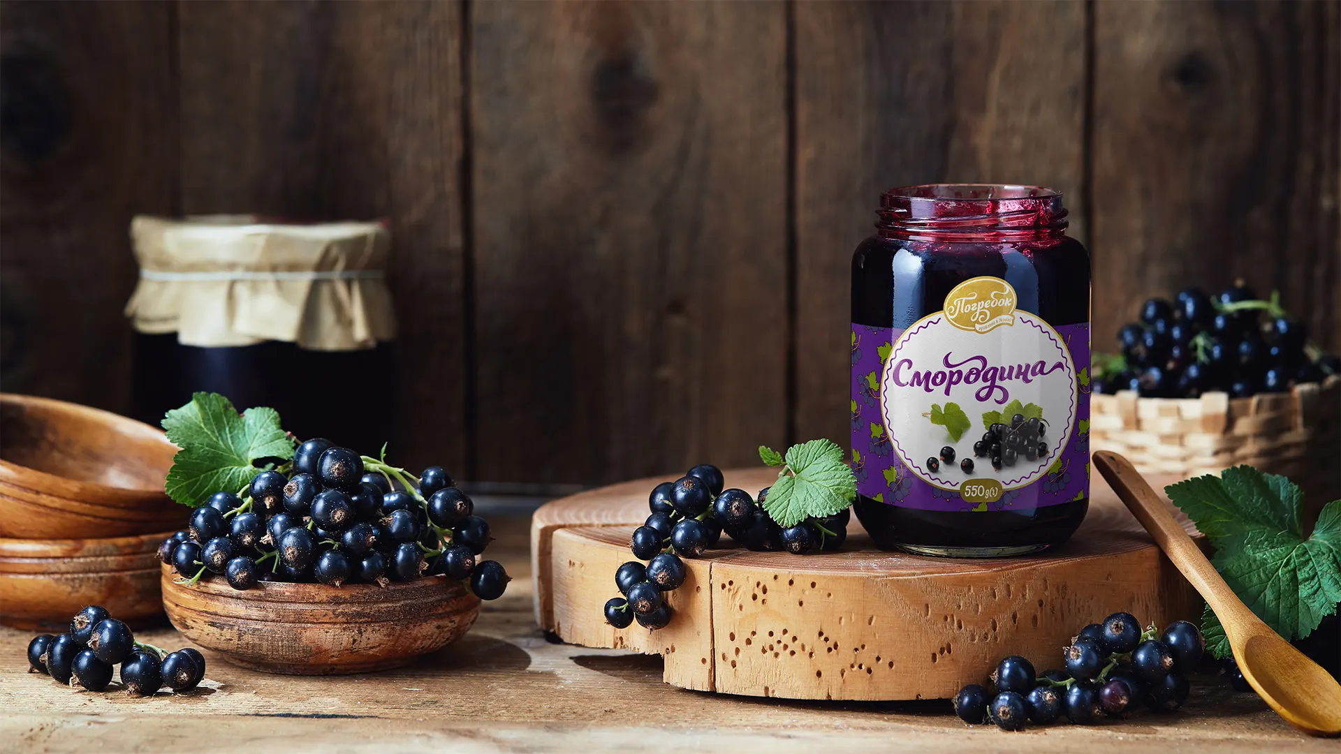
Pogrebok is a Ukrainian brand that brings us back to the tastes of childhood: jars of jam in grandma’s cellar, the aroma of fresh berries, warmth and coziness. The product is based on natural ingredients, and the visual language of the brand is designed to emphasize its sincerity and homemade character.
The task was to develop a series of labels for berry jams that evoke associations with homemade preserves, have a modern yet heartfelt presentation, and are easily distinguishable by flavor on the shelf.
Solution
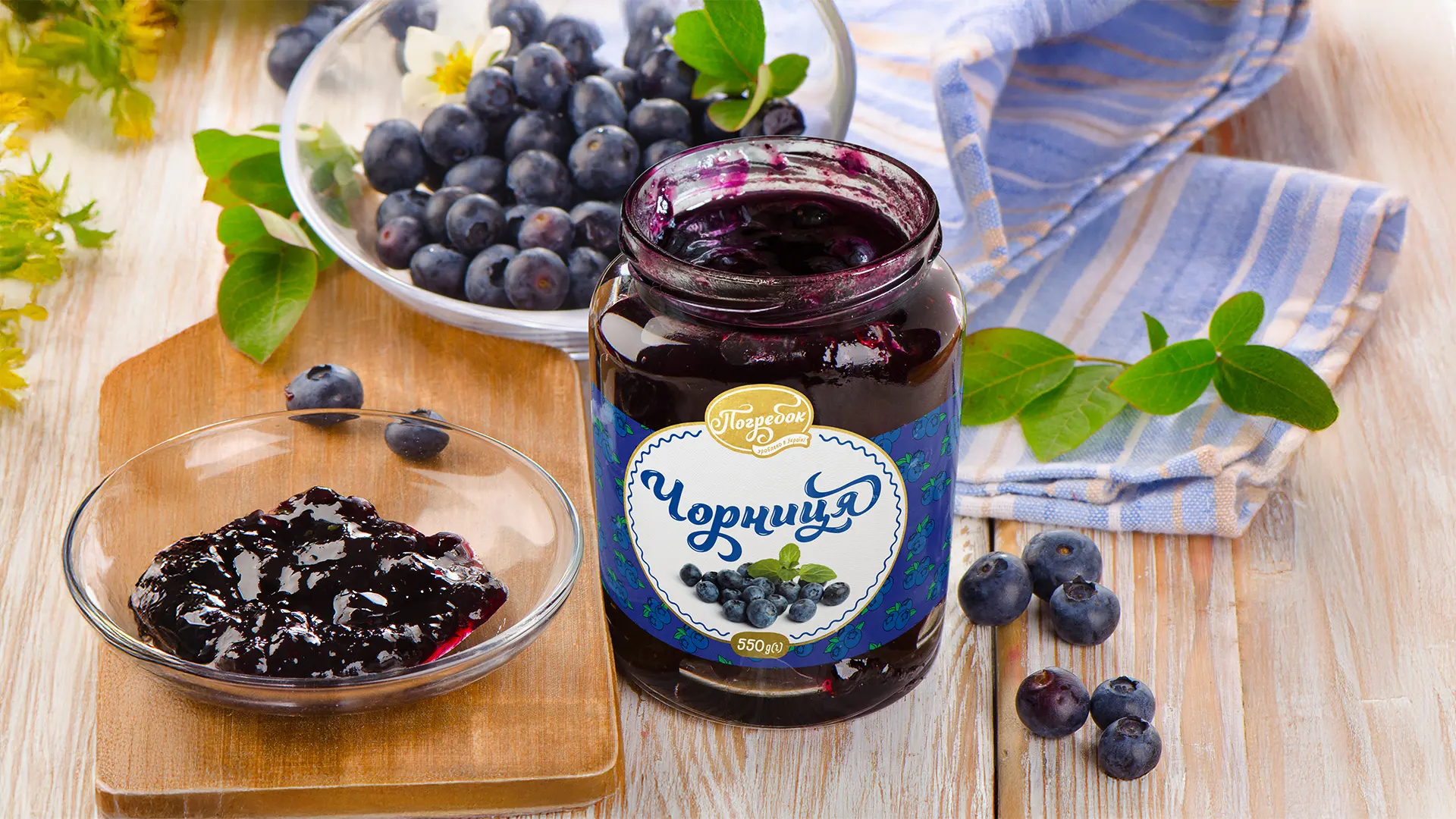
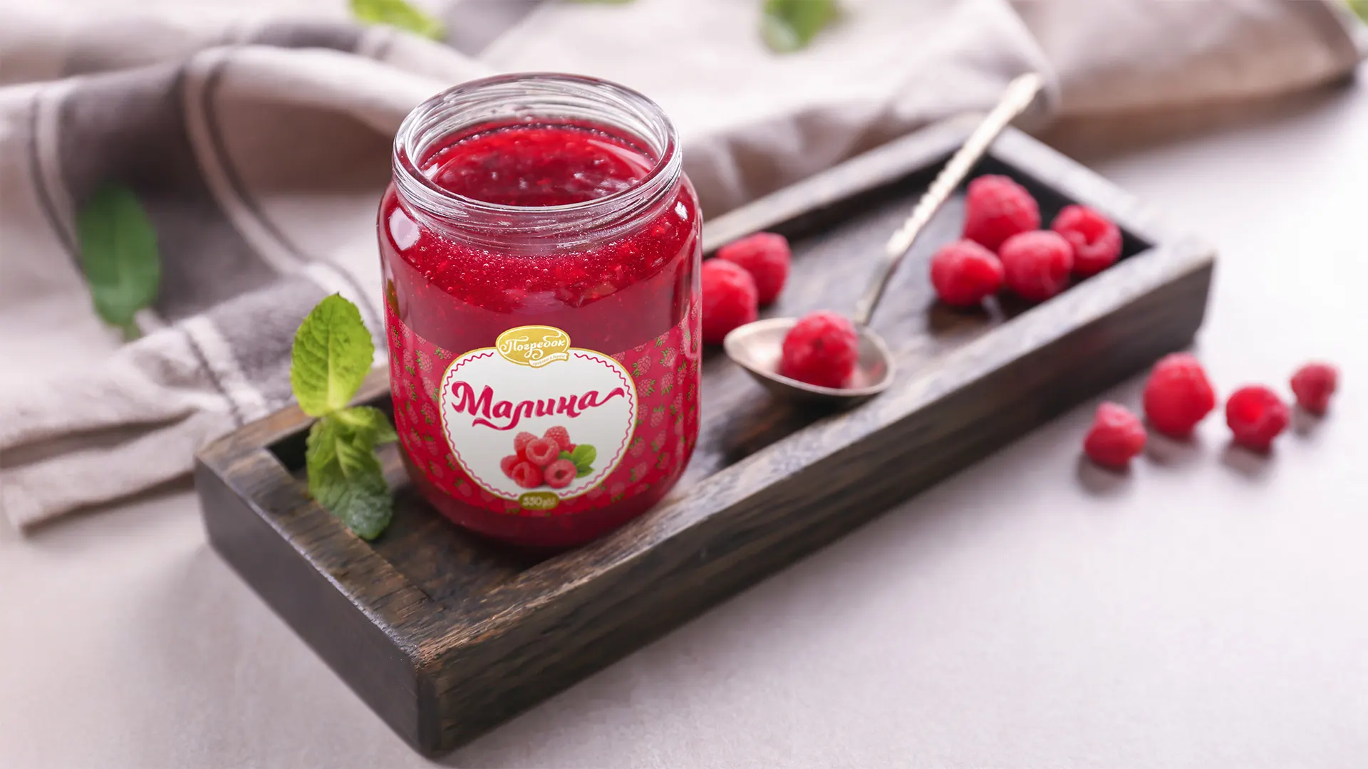
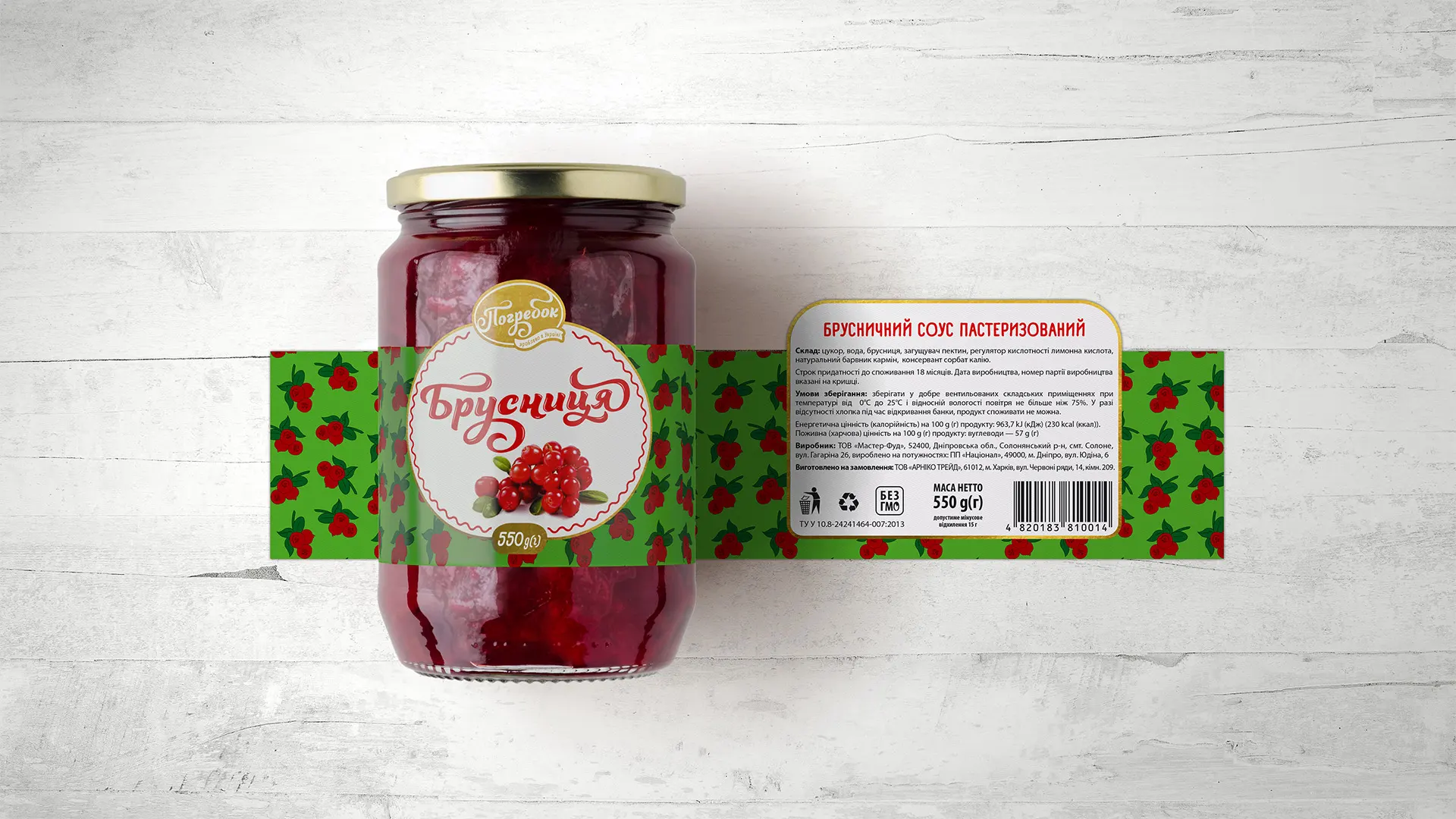
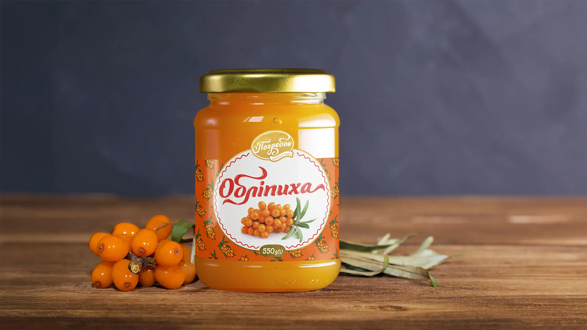
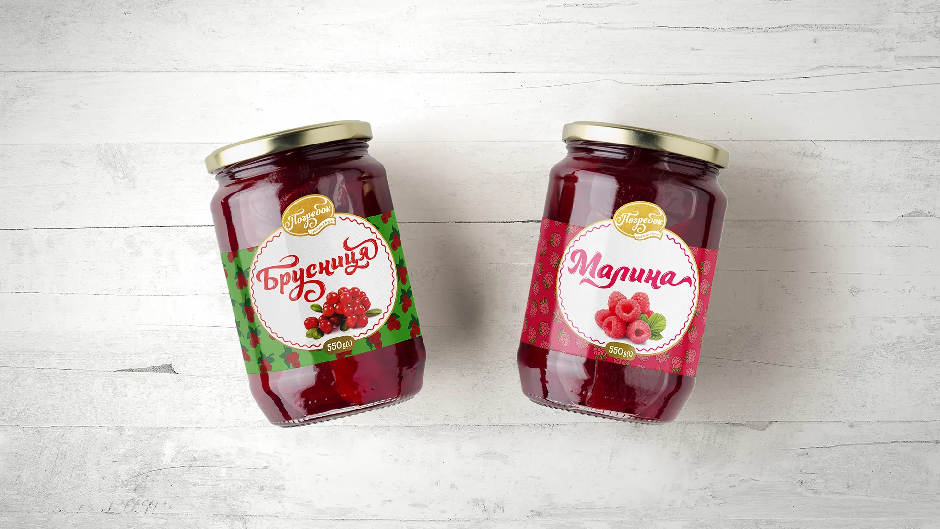
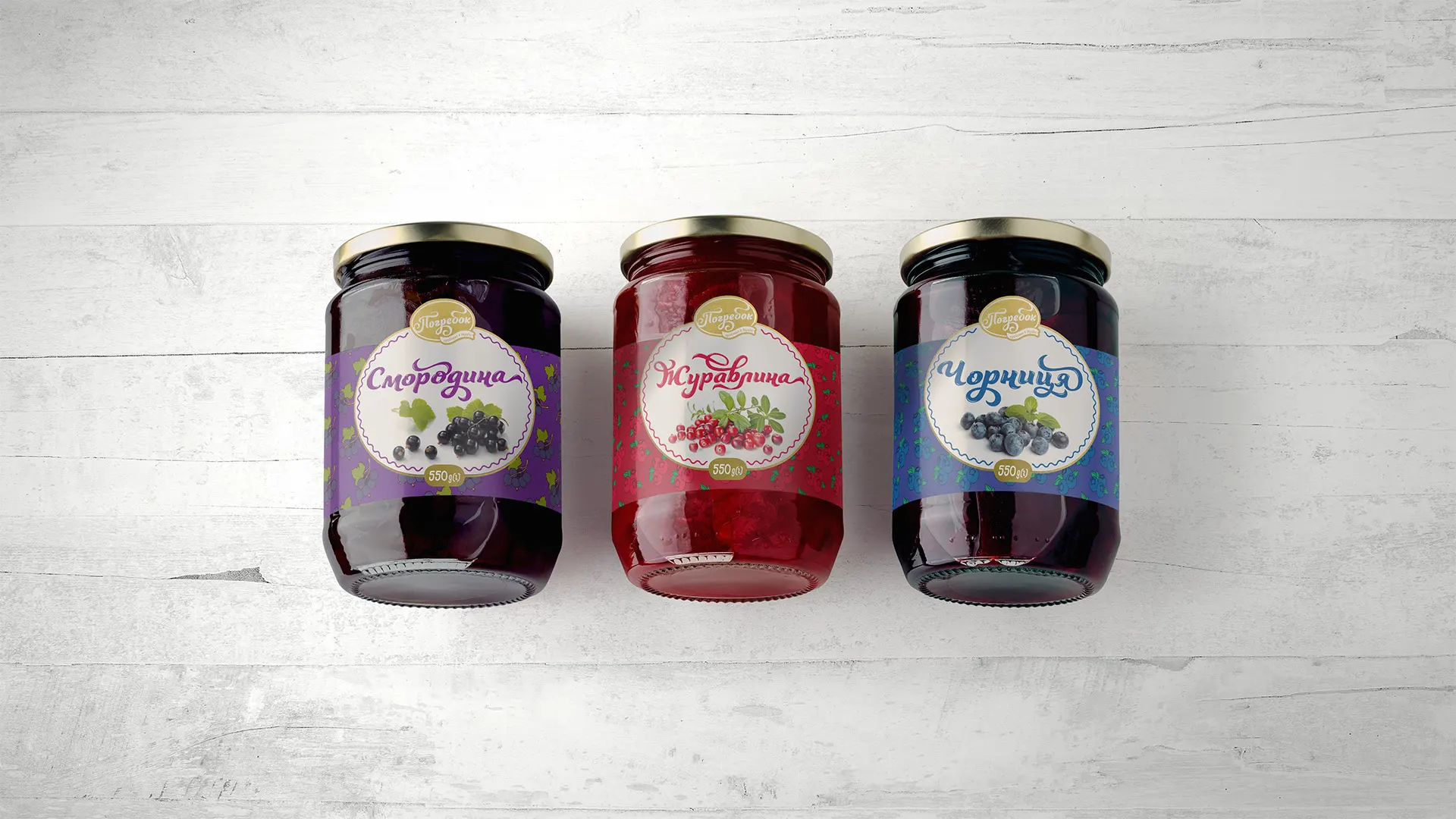
We built the design around familiar visual elements: a round label with a decorative frame, a handwritten-style name, and a color palette tied to each specific flavor.
Key elements:
- Flavor color coding: each jam has its own color scheme to facilitate easy navigation through the assortment.
- Berry ornament patterns along the label’s edge add visual rhythm and recognizability.
- The “Pogrebok” logo features a golden accent and a “homemade” aesthetic that builds trust.
- Fruit photography in the center emphasizes naturalness and aids product perception.
Result
Labels that combine a traditional character with visual clarity, creating an appealing and trustworthy brand image. They are easy to read, have clear flavor identification, and evoke associations with homemade, time-tested products.